Catalogue and poster
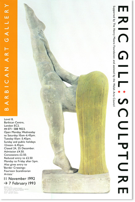
The poster shows one of the uses of a “style” for the Gallery. which used various weights of Gill typeface.
The style, the result of a closed competition, was intended to be used
as a guide for different designers. The only stipulation was the use of
the Barbican Art Gallery namestyle in a long black rectangle and that
all the type should be in a variation of
Gill Sans or Gill Bold. The style had a short life.
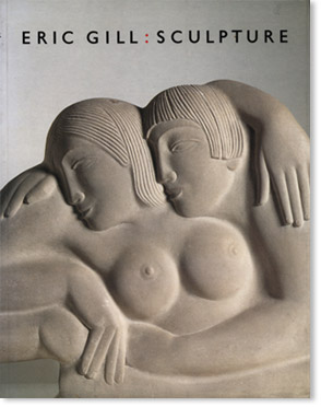
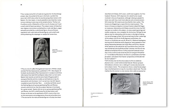
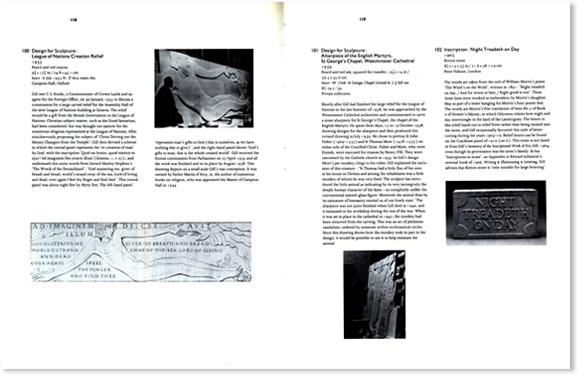
The typefaces used in the catalogue were Eric Gill designs: Joanna and Gill Sans.
Client: Barbican Art Gallery


